
In earlier tutorials, we walked through the whole process of building a desktop website and refining its features.
But a website has to work not only on a computer screen; mobile cannot be overlooked either.
Next, let's try this together:
01
How the Current Version Looks
First, we need to know how to preview a website's mobile display inside Google AI Studio.
Click the square logo with four corners at the far right of the image to see the page exactly as it appears on the current device.

Then press F12 on your keyboard and the interface below will appear.
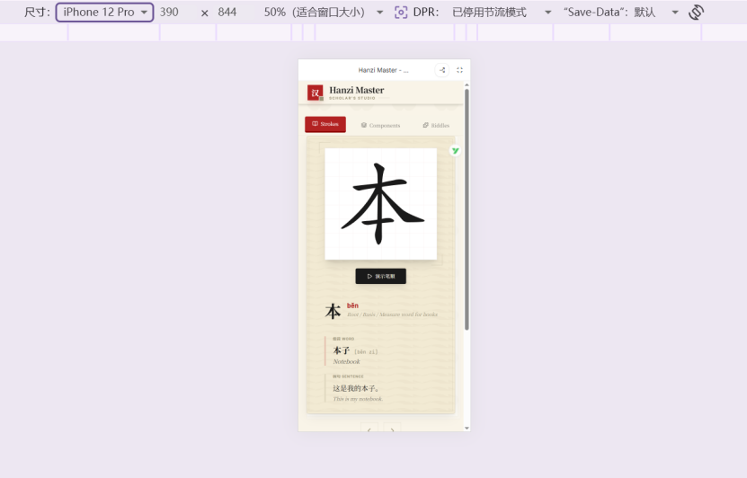
Here you can choose the dimensions of different phones or tablets to preview how the site looks on mobile.
As the screenshot shows, Google AI Studio has already quietly adapted the site for mobile.
But without guided human debugging, the mobile view still cannot fit all the essential features onto a single page.
The Current Problems
The panel for switching characters and the panel that displays them can no longer be fully visible at the same time, which makes the experience feel fragmented.
02
Optimising the Mobile Display in One Sentence
So I stressed one more thing to it:
“Keep the current desktop features and UI unchanged, and adapt this page for mobile.”
It soon produced a much better adaptation, and every section's full functionality can now be experienced on the same page.
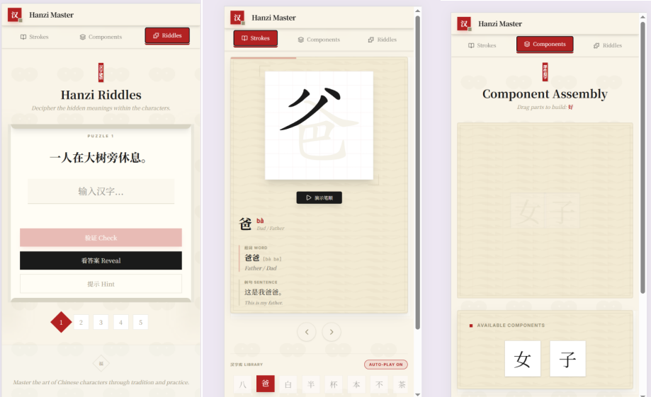
There are only three sections for now. With five or six, you can add a menu button and tuck the different sections inside the menu.
This keeps the layout clear and the site easy to use — several benefits at once.
For more mobile-adaptation tips, just ask the AI directly in the chat box.
